Hey all,
I recently had the luck to take a four day trip to New York City. While I was down there (I was there for a Twitter conference), I made sure to take in as much theatre as I possibly could. What I saw during those four days (three nights, really) were three very different shows, and three very different designs that I wanted to break down here.
Today, I will start by breaking down the lighting design and scenic design for Next to Normal.
Part one: Next to Normal
The first show I saw was the new musical “Next to Normal”. A new musical about a family coping with a mother’s psychological condition, “Next To Normal” took a stripped down and sculptural approach to design. Built on scaffolding, the show creates multiple settings in the various open areas of the scaffolding, and by manipulating the positions of a few translucent walls.
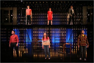
The set is also adorned with hundreds of light bulbs that serve to light and color the set. Interestingly, they were designed to look like incandescents, though I’m fairly certain they were actually LEDs (they definitely changed colors at several points). I’d be curious to know for sure. These bulbs were interesting because although they were lighting pieces, they were definitely a function of the scenic design, helping define different areas depending on what was lit. They weren’t designed to illuminate performers, rather to attract your eye to the different sections of the scenery.
The orchestra was placed on stage, in the set. I tend to favor this kind of placement, and it tended to work for this type of rock musical, but occasionally a stagehand or a musician had to run around for whatever reason and that distracted from the action. So there’s a warning – if you’re going to put the band on stage, make sure they know not to distract from the other action!
The Cyc
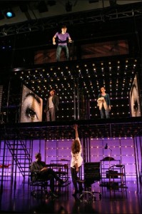
The cyclorama definitely did change colors throughout the performance though, often reflecting the music. It was generally cold throughout the show, sticking to blues, occasionally venturing into greens or purples. It did venture into warm territory occasionally, but infrequently. Interestingly, the cyc often seemed to be lit in portions, based on the level of the scaffolding. Often, the ground floor would appear to be a pure blue, and the upper level would seem to be a purple. I’m not sure if this was actually due to color mixing or some other trick (they might have had LEDs placed in the second level of the scaffolding – it was very tough to tell). I loved the use of the cyc, and how they got playful with changing colors (the ‘rock doctor’ sequence is memorable for this).
Halftone

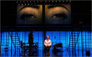
Halftone will blow your mind
The design of the “flats” was unique – they used a halftone look on (I’m assuming) plexi so the pieces were translucent from the audience’s perspective. The halftone look carried on in the close placement of all the bulbs and created a very “dotty” feel (for lack of another descriptive term). One could infer that the halftone was used because it creates images that “aren’t all there”, and thus neither is our lead character or a healthy family dynamic or… you get the idea.
I captioned this image to the right (demonstrating halftone) as “halftone will blow your mind”. The show has an actual standard halftone plexi flat (white) bumped up against the cyc in two sections of the scaffolding, and I spent a significant amount of time confused and bewildered trying to understand the optical effect I was seeing. Something about how it was lit masked the halftone and how sometimes the pattern appeared or disappeared totally blew my mind (it only became clear once the lights dimmed for intermission). Maybe they planned for that too!
The flats, in motion
Those same halftone flats were also moving throughout the show, on and off the stage. They appeared to be on a track system, although they shot on and off stage with incredible speed and accuracy that it might have been something more sturdy (or Local One is just that good!).
There were several different sets of flats (all in halftone), a house, eyes, and a mouth (combine to make a face). Depending on the placement of these flats, the show created very surreal scenarios for their characters – a scene taking place in the bathroom or the bedroom of the daughter always had the eye of the face watching over. The face itself was one of the most iconic aspects of the design, although I’m hesitant to analyse it for fear of totally missing the boat. It came on stage in pieces, eyes first, followed by the rest of the head in the second act – perhaps it represents Diana (the main character)’s journey in discovering herself and seeing herself as she exists? I’d be curious to hear from the designer what his intention was.
Lighting it up

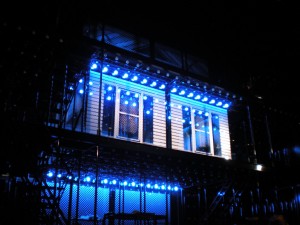
Lighting up a house
I’ve already mentioned the awesome incandescent-style fixtures that adorned the set. While I don’t believe they were designed to illuminate any actors (and probably fell under the scenic designer’s jurisdiction) they were undoubtedly utilized by the LD to light up the scenery itself. As the picture to the right shows, the bulbs were great for sculpting the set. Combining the bulbs with the halftone panels created a really great look (especially when the bulbs were behind the plexi panels, and really exposed the halftone pattern).
The standard lighting design itself seemed to borrow from two worlds, as was fitting based on the musical’s influences. Rock design pervaded the lighting, with frequently flashy musical sequences, bright colors, and other conventions more fitting for an arena stage (get it? get it now?) than a Broadway stage. But in the more dramatic scenes, and especially in the second act, it takes on a decidedly darker tone that reflects the text, as opposed to the first act reflecting the music’s tone. The rock tone is no surprise though; Kevin Adams designed the show, and with a portfolio that includes design for the revival of Hair, Passing Strange, and Spring Awakening, he was a natural choice.
The final scene (which I won’t spoil) was particularly moody in its lighting. Because it’s such an important plot point I can’t reveal the plot, but the lighting was great. A stage which had been almost entirely lit for the duration of the show is reduced to near darkness, until… (see the show, you’ll see).
Putting it all together
This was one of the best musicals I’ve seen on Broadway (certainly compared to the show I had just seen a week before this, the revival of Guys & Dolls – but that’s another story). Stellar performances, a great score, and awesome design made this an awesome experience and a great start to my theatre trifecta.
It’s highly recommended for its provocative story and puzzling (in a good way!) design. The halftone makes you think, and exposes the layers of the characters that inhabit it.
3 1/2 stars!
The details
Next to Normal at the Booth Theatre
Lyrics by Brian Yorkey
Music by Tom Kitt
Book by Brian Yorkey
Directed by Michael Greif
Scenic Design by Mark Wendland
Lighting Design by Kevin Adams
Costume Design by Jeff Mahshie
Sound Design by Brian Ronan
The run is open-ended.


