My favorite animated Disney movie of all-time is the 1961 classic One-Hundred and One Dalmatians, based on the Dodie Smith novel of the same name. One of the last animated movies made during Walt Disney’s life, it’s a designer’s dream film, full of beautifully painted backgrounds, stunning character design, and visually modern settings. I thought we’d take a little diversion from the world of stagecraft and check out this (in my humble opinion) under-appreciated diamond of the Disney collection. There’s not only a lot to learn about animation and filmmaking, but we can learn so much about design from this film.
Really, Dalmatians is unlike anything Disney had produced up to that point. There are a lot of reasons why, but primarily it was because it was the first Disney film to fully use a new Xerox process that enabled faster, cheaper animation, reducing the need for the huge staff of painters and inbetweeners (the artists who actually drew the thousands of frames in the movie, not just the key poses but the ones “inbetween” them) that existed before. The Xerox process also made the primary animator’s original imagery appear on screen, because the painters and inbetweeners no longer had such a strong effect on smoothing it down to the fairy tale look that Disney had pioneered in earlier films.
Even from the beginning of the process of designing Dalmatians, it’s clear that this film would have a radically different design. Early color keys and concept art showed modern tendencies that were unprecedented in Disney’s canon of animation.
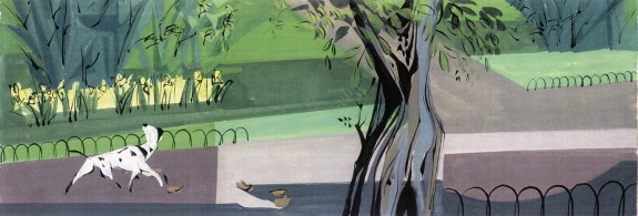
Above is a color key by background designer Walt Peregoy. The key illustrates color choices for backgrounds and the natural environment of the film. Peregoy’s design is distinctly modern, and has a slightly messy “outside the lines” appearance – he’s not looking to create the exact look, but rather evoke it. Amazingly, this look was preserved in the actual film, and was only barely cleaned up.
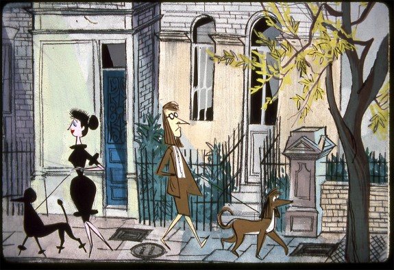
The character design is similar. Below is an design concept from the opening scene of Dalmatians – the popular walking sequence. It’s not attributed to any artist (although it has Bill Peet, the film’s writer and storyboardist, written all over it!). Looking at it, there are hardly any traces of traditional Disney elements (flowing, cherubic, romantic character design) – it’s supplanted for caricatures, and more comedic design. It looks like something out of a recent children’s book – appropriate, considering Bill Peet would go on to have a long and successful career as a children’s book illustrator.

Concept design art. No artist attribution available, but it looks like the work of writer/storyboard artist Bill Peet.
Studying these two concept images, they share some key elements that would define the Dalmatians style…
- Sharp, angular character design. While clearly Disney didn’t animate with only circles and ovals before, Dalmatians represented a shift in that angles became a core thread in the design fabric. The second image has much of its funk derived from angles; just check out those pointed noses! Pointed feet! The angles on those elbows and the clothes! Even the dogs follow suit.
- Blocky background color. Walt Peregoy’s genius shines through in his hip color keys. Rather then Disney’s traditional, romanticized, blended backgrounds that look more like romantic-era art (see Snow White for the original and best examples), Peregoy chose not to blend (at least not so blatantly), and rather to isolate various areas in specific colors. The result is a sharply focused look that pulls Dalmatians into the modern age.
- Natural color choices. The film isn’t afraid to eschew the traditional bold Disney colors. This is no fairy tale, and Peregoy and other colorists treated it thusly. We see appropriate London gray skies, browns and tans on the houses, and low-saturate greens on trees and shrubs. At only a few points does the look move into bold, primary color territory, and it’s jarring – the effect the filmmakers were certainly going for.
These three points are key to unlocking the style of One-Hundred and One Dalmatians, and set it apart from any Disney film that had preceded (although arguably sections of Lady and the Tramp come close – some of the Xerox techniques that were so crucial in Dalmatians were first being tested in Tramp).
You can see these attributes in effect in production stills and backgrounds. Let’s go through a few and analyze…

Three shots from London. Thanks to Colorful Animation Expressions for the shots. Click for full size.
The above image is from the opening scene of the film (post-titles). We see the quaint London neighborhood where Pongo and his “pet” Roger live. From the outset, it’s clear that this is no typical Disney film. The sky is bleak and gray, reflective of the mood of our main character, Pongo (notice his expression and posture in the third picture). In fact, the sky actively reflects the mood of the scene throughout the film – a little later on when Pongo takes notice of Perdita and brings Roger to the park to meet her, things are looking much cheerier. Even later, the skies are foggy and dark when the puppies go missing. The background is also blocky and blending is rare (this would be even more pronounced later in the film).
Also notice: Upon close examination, the building design looks more like a sketch than a meticulously drawn Disney film. This is not to detract from the work of the artists, it’s simply not the Disney norm. Also notice the trees in panel two and three that are slightly blurred – this is the magic of Ub Iwerks’ “Multiplane Camera” which allowed animators to set focus for different levels of an image.
In this image, you can see the obvious change in color; greens are more saturate, yellows have mixed into the trees, the sky is taking on more and more blue, etc.
But color isn’t why I posted this picture – it’s character design. The angles are pronounced and strong, postures are distinct, and the animators are at top form, playing with people in crazy positions. That last image is quite impressive for the complex illustration of a leash tangling – the Disney animators prove their genius and why they were head of the class.
Also notice: Shadow. Just notice it, especially in that first shot. Wow.
Last but not least, the foggy London night when the Pongos escape for the north. These are beautiful pictures in their own right, and some of the most detailed and non-Dalmatians-like shots in the film. In fact, only the second image shows any noticeable traces of the sketchy-style that made up most of the movie. They still fit though, and the color and lighting has a lot to do with it. In fact, the lighting in this sequence is among my favorite in the film. The beautiful look of the street lights shining through the fog is perfect for this scene, and accents their journey into the unknown. These images could certainly be candidates for lighting inspiration images when preparing a lighting design!
Also notice: The way the damp road reflects in the last panel.
So there you have it, a short introductory look into one of my favorite Disney films. We started to dissect the elements that I believe make this film visually unique among the Disney canon, and looked at some examples from the film itself.
Dalmatians is an incredibly unique film, and definitely deserves your attention. If you’re interested in reading more about it, here are some links you might enjoy…
- Colorful Animation Expressions brilliant series that details the color design in the film. A huge inspiration for this post and the source of some of my screenshots. He does it bigger and better.
- Color keys from the film by Walt Peregoy. Not only are these a great way to look at the color design choices of the designers, but they provide a neat look at the conception stage of the film. They’re also just plain good art.
Thanks for reading, let me know what you think in the comments!


The Inaugural Bi-Weekly Link Roundup | | YouMakeMedia YouMakeMedia
[…] Bag: I’ve blogged my love for Disney’s One Hundred and One Dalmatians on other sites before, and loved this post by […]
Oct 21, 2011 @ 14:42:05Chris Van Patten
Sheryl – Too true! Sleeping Beauty is, well, beautiful, and in no small part thanks to the brilliance of Mary Blair. I would actually argue that all the art in Sleeping Beauty (the main characters excepted) is just as innovative as 101 Dalmatians. The difference is the level of polish. While we appreciate the roughness as it offers a window into the artists’ worlds, it contrasted with the sanitized, pure world that Disney wanted to present. He wanted smooth, and Dalmatians was not it.
That said, we should consider ourselves lucky he stepped back and let others take over; without that, we probably would not have had this wonderful anomaly in the Disney canon!
Jul 03, 2011 @ 15:39:31Sheryl V
Like you, I consider this my favorite Disney film. I love the art direction in it and I definitely feel its unfortunate that its overlooked so often.
Apr 07, 2011 @ 00:49:50That is why I find it unbelieveably heartbreaking to know that Walt Disney himself wasnt happy with this movie from the very first design pitch. Its understandable of course — having just completed Sleeping Beauty which most of the companys money went into.. I mean you could pause that movie at any given moment and have that screenshot placed on your wall and everyone would think it was fantastic. In his eyes it was crap compared to Beauty. I wish he looked at this movie like we did. Think of how much more amazing it would have been if he had put his heart into it instead of stepping back and letting others take over…
Sandy
I cannot believe no one has commented on this yet! In terms of the art this is my all-time fave Disney film. It was great to see these images you have collected, as well as learn about why it looks as wonderful as it does. Thanks for posting this!
Jan 08, 2010 @ 02:47:38